03 July 2026
Colour direction shapes assortment success
For wholesale buyers building 2026 rug collections, colour forecasting is not an abstract design exercise — it directly affects sell-through, markdown exposure, and retail shelf presentation. Euro-Tapis develops collections aligned with commercial colour direction observed across European and North American retail, trade fairs including Heimtextil and NY Market Week, and interior design specification trends.
This forecast highlights the colour families performing strongest in B2B rug programmes — and how to translate trends into wholesale assortments across woven, tufted, and printed constructions.
Earthy neutrals remain the commercial backbone
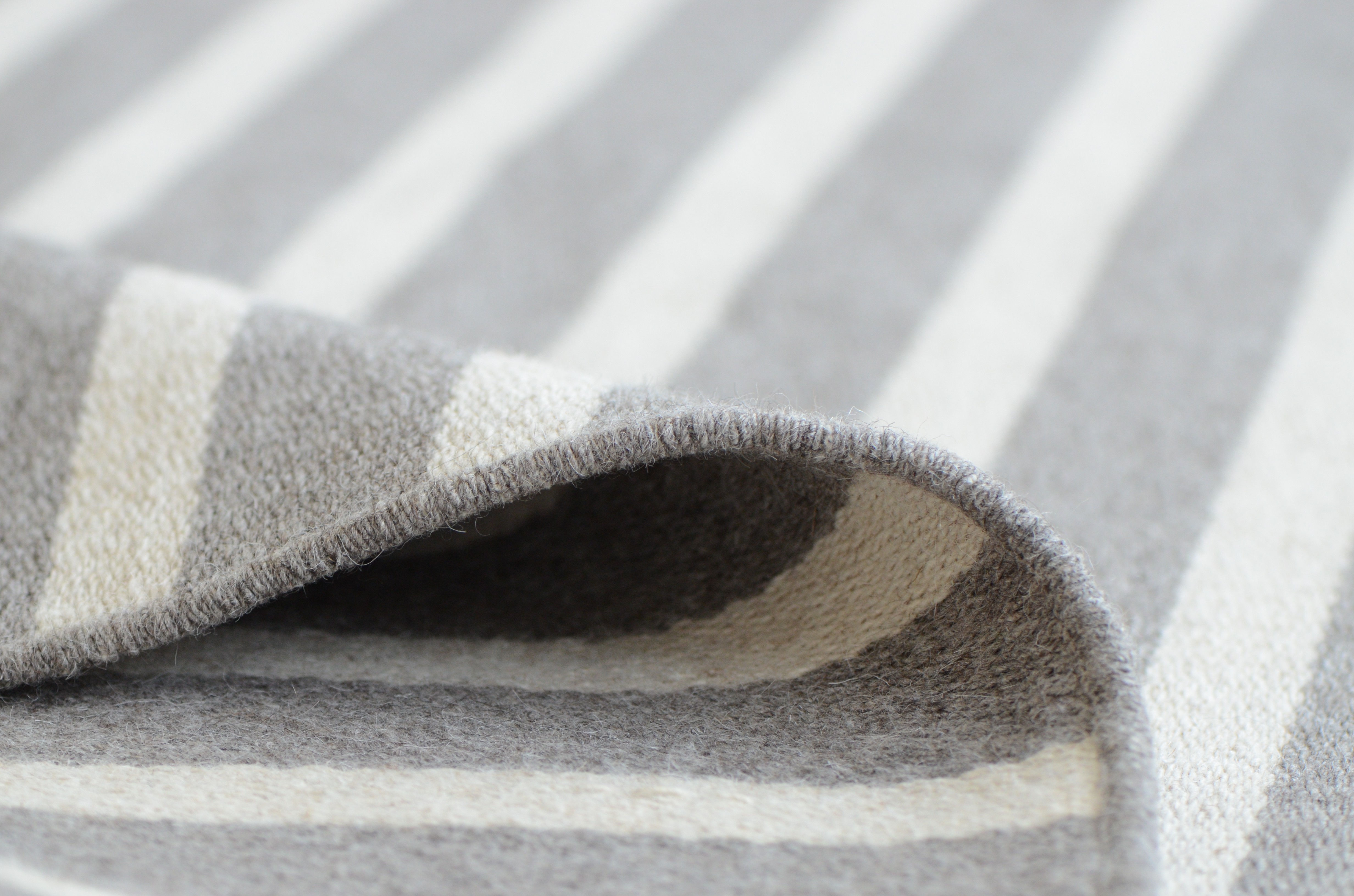
Warm beige, taupe, stone grey, and soft oatmeal tones continue to anchor rug assortments across price points. These neutrals serve as versatile foundations that coordinate with diverse interior palettes — essential for retail chains needing broad consumer appeal.
Within neutrals, 2026 direction favours warm undertones over cool grey-dominated palettes. Sand, wheat, and clay neutrals outperform blue-grey tones in current retail performance data.
B2B recommendation: Maintain strong neutral core SKUs across all size runs before layering trend colours.
Muted greens gain specification share
Sage, olive, forest muted tones, and blue-green shades appear consistently across hospitality specification, interior design projects, and consumer retail. Green connects to biophilic design trends and sustainability messaging without requiring explicit eco-branding.
Green performs particularly well in tufted constructions where depth of colour and texture variation add visual interest to otherwise restrained palettes.
Warm terracotta and rust accents
Terracotta, burnt sienna, rust, and warm coral tones provide accent energy within otherwise neutral-dominated rooms. These colours work effectively in printed rug programmes supporting seasonal collection refreshes and bohemian or Mediterranean interior trends.
Accent colour SKUs should complement — not replace — neutral foundations in wholesale assortment architecture.
Deep, saturated statement tones
While neutrals dominate volume, selective deep tones — navy, charcoal, burgundy, and chocolate brown — serve premium and design-led retail segments. Woven constructions carry saturated colours with exceptional depth and pattern clarity.
How to build a trend-responsive wholesale programme
Successful B2B colour strategy balances three layers:
- Core neutrals — 50–60% of SKU count, consistent reorder performers
- Directional trend colours — 25–30%, refreshed seasonally via printed and tufted constructions
- Statement and accent SKUs — 10–20%, design-led differentiation and premium positioning
Custom colour development allows retail partners to align exclusive collections with brand-specific palettes while maintaining Euro-Tapis construction quality.
See 2026 colours in our collections
Colour accuracy matters — digital swatches and catalogue photography cannot replace sample evaluation under showroom lighting.
Visit Euro-Tapis showrooms in Beveren-Leie or New York to review 2026 colour direction across our full wholesale rugs range. Contact our team to request colour cards and trend collection samples.